
 TGR Staff
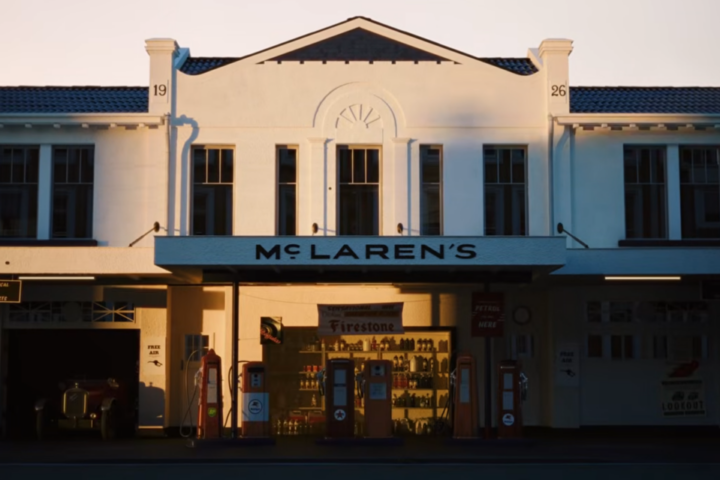
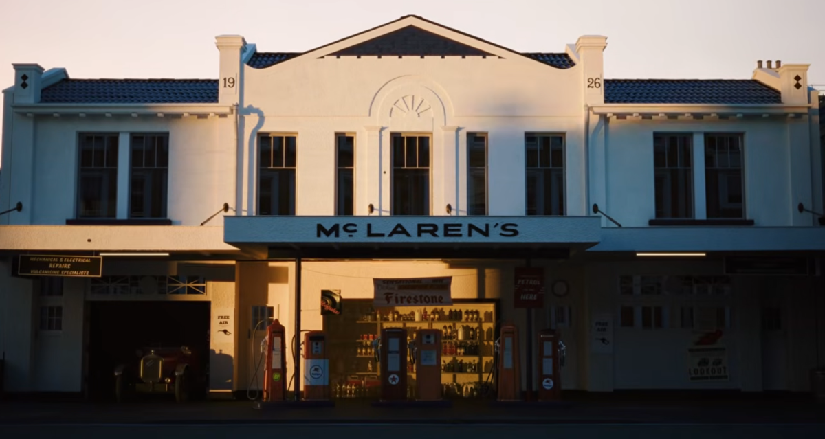
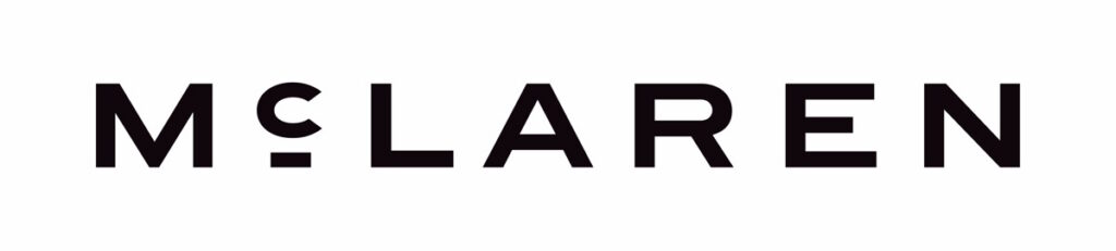
McLaren revealed an evolved visual identity that will extend across both McLaren Automotive and McLaren Racing. At the center of the redesign is a new McLaren wordmark inspired by the sign that once hung above the McLaren family service station in Remuera, Auckland, New Zealand.
It was more than simply the family business. Bruce McLaren’s parents, Les and Ruth McLaren, ran the garage where a young Bruce worked on the car that would take him to his first racing victory. More than six decades later, McLaren has returned to that humble garage sign as inspiration for the visual identity intended to carry one of the world’s most recognizable performance brands into its next era.
Enjoying this story?
Join The Gentleman Racer email list to continue reading.
Occasional updates. Unsubscribe anytime.
The rebrand comes just one year after Bahrain’s sovereign wealth fund Mumtalakat and Abu Dhabi-backed CYVN Holdings completed a series of landmark acquisitions, giving Gulf investors full ownership of both McLaren Automotive and McLaren Racing.
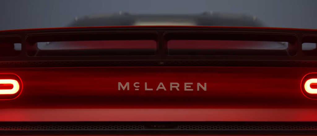
New McLaren Logo Looks Back to Move Forward
The new identity replaces the familiar modern McLaren lettering with a wordmark that has considerably more connection to the company’s early history. McLaren says its Automotive and Racing design teams began the project by studying the company’s archives, tracing visual elements from Bruce McLaren’s beginnings in New Zealand through the modern Formula 1 team and road car business.
The resulting wordmark is a contemporary interpretation rather than a literal recreation of the old service station sign, but the connection is unmistakable. For a company founded by a racer who started out working in his parents’ garage, it is difficult to imagine a more appropriate place to look for inspiration.
McLaren Chief Creative Officer David Woodhouse described the change as part of the company’s larger evolution, saying the identity reflects its ambition, creativity, and forward momentum. Importantly, McLaren has not thrown out everything enthusiasts already associate with the company.
The familiar Speedmark remains. Papaya remains. And the Speedy Kiwi remains.
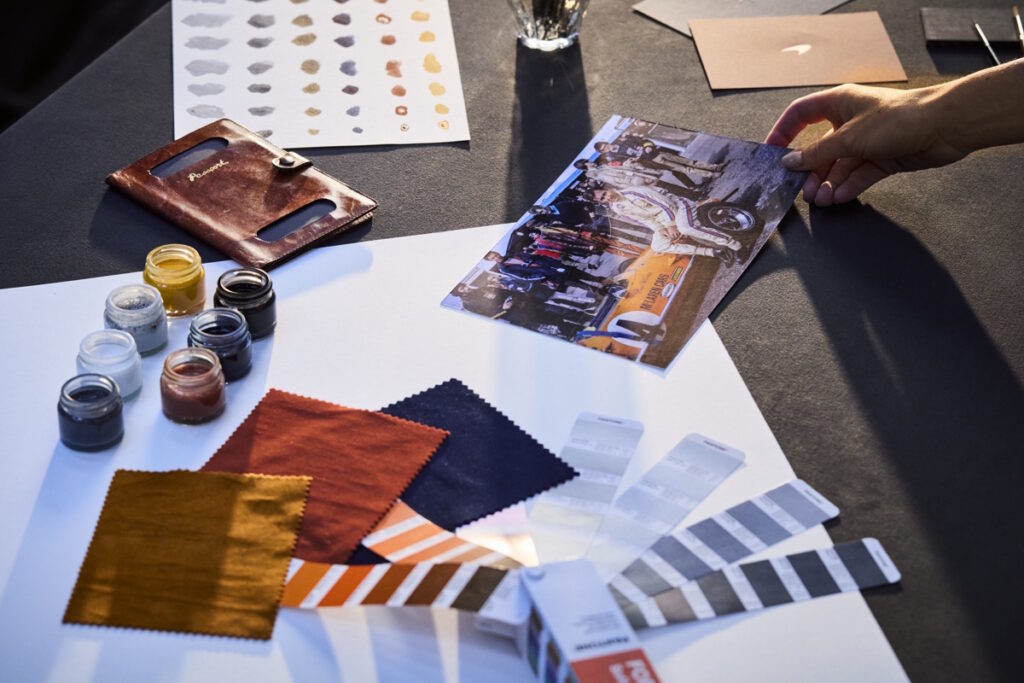
Instead, McLaren is building a larger visual vocabulary around those existing symbols. The company says papaya will be joined by an expanded color palette based on important periods in McLaren history. The video below takes you through the brand’s idenity from the very begining until today. This makes it feel less like a conventional rebranding exercise and more like an attempt to connect several generations of McLaren design under one roof.
The McLaren Logo Has Always Evolved
McLaren’s badge has changed many times since Bruce McLaren Motor Racing was founded, so another evolution is hardly unprecedented. Motorsport artist Michael Turner created the original McLaren crest in 1964, incorporating a Kiwi to reflect Bruce McLaren’s New Zealand heritage.
In the 1970s, the graphic evolved into the famous Speedy Kiwi, a more dynamic version of the bird that became associated with McLaren’s rapidly growing racing reputation. A major break came during the 1980s when the company adopted the McLaren International identity designed by legendary industrial designer Raymond Loewy. Its geometric elements evoked a checkered flag and became closely associated with one of the most successful periods in McLaren Formula 1 history.
During the 1990s, those multiple chevrons were gradually reduced before McLaren introduced the precursor to its modern Speedmark in 1997. The Speedmark survived further redesigns in 2007, 2017, and 2021, gradually becoming one of the most recognizable elements of the McLaren brand.
The 2026 identity therefore does not represent McLaren abandoning its established symbols. It adds another chapter to a logo that has been changing almost as long as the company’s race cars have. This time, however, the most visible inspiration comes from before the racing team technically existed.
Why McLaren Is Changing Now
McLaren is entering a period in which both its racing activities and road car business are expanding beyond their recent boundaries. McLaren Racing celebrated its 1,000th Formula 1 Grand Prix at Monaco during the 2026 season, becoming only the second F1 team to reach that milestone.
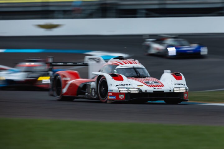
At the same time, McLaren is preparing to return to the top level of endurance racing. The new McLaren MCL-HY Hypercar is scheduled to compete in the FIA World Endurance Championship beginning in 2027, including an attempt at an overall victory at the 24 Hours of Le Mans. The program puts McLaren in a position to pursue another Triple Crown of Motorsport, combining victories at Monaco, Indianapolis, and Le Mans.
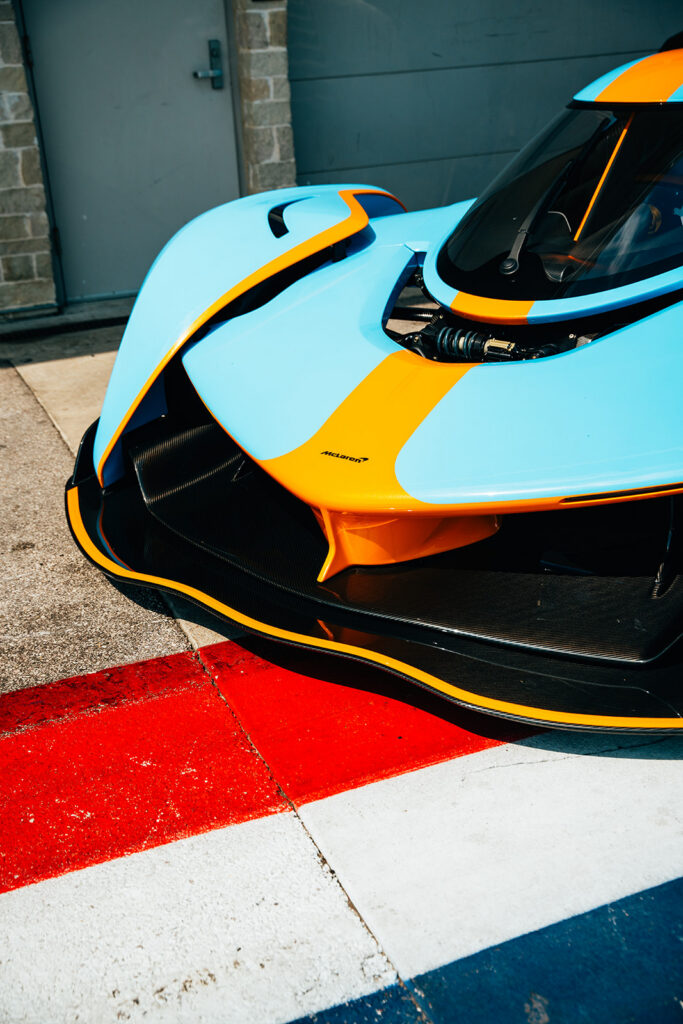
That car itself has been used as a bridge between eras. Its development livery takes inspiration from Bruce McLaren’s M6A, while the broader Hypercar project references Bruce’s unrealized ambition to take the M6GT to Le Mans. McLaren Automotive is undergoing an even more consequential expansion.
The company says it is investing £500 million in its UK manufacturing and engineering operations while preparing to move beyond the two-seat supercar formula that has largely defined modern McLaren road cars. That expansion includes a forthcoming McLaren performance SUV, a vehicle that could fundamentally change both the size and makeup of McLaren’s customer base.
The company has also been putting greater emphasis on personalization, ownership experiences, community, apparel, and lifestyle, areas where a more flexible brand identity can become almost as important as the badge fitted to the nose of a supercar.

Bruce McLaren Returns to the Center of the Story
There has been a noticeable pattern to McLaren’s storytelling throughout 2026. The company is leaning into its heritage, with Bruce McLaren himself increasingly at the center of it. The company has highlighted the M6GT and Bruce’s early ambition to build road cars, celebrated McLaren’s 1,000th Formula 1 Grand Prix, brought elements of historic liveries back into competition, and connected its upcoming Le Mans effort directly with projects Bruce never lived to complete.
Even the Speedy Kiwi, which largely disappeared from McLaren Formula 1 cars during the 1970s, has periodically returned as a nod to those New Zealand origins. The new wordmark takes that approach further. Rather than creating something designed only to appear futuristic, McLaren has based its future identity on something that existed before carbon-fiber monocoques, Formula 1 championships, the McLaren F1 road car, or even McLaren Racing itself.
For all the technology associated with modern McLaren, the company ultimately began the same way many great automotive stories did: with a young man, a car, some tools, and a garage. The new wordmark pays homage to that.
More Than a New McLaren Logo
McLaren describes this as an “evolved identity,” and that may be the most accurate description. The Speedmark has not disappeared. Papaya is not going anywhere. Neither is the Kiwi. Instead, the company appears to be making its history more visible as McLaren grows into something broader than a Formula 1 team and low-volume supercar manufacturer.
The new wordmark may eventually appear on everything from racing uniforms and merchandise to future McLaren road cars, including vehicles quite different from the Artura, 750S, and previous generations of two-seat supercars. That makes the redesigned lettering a small visual change attached to a much larger transformation.
And while McLaren is unquestionably looking toward a bigger future, its new logo serves as a reminder that the road ahead still leads back to a small service station in Auckland where Bruce McLaren first started building something of his own.
Quick Facts
- What happened: McLaren introduced an evolved global brand identity
- Reveal date: September 22, 2026
- Applies to: McLaren Automotive and McLaren Racing
- Major change: New McLaren wordmark
- Inspiration: McLaren family service station in Remuera, Auckland, New Zealand
- Family business owners: Bruce McLaren’s parents, Les and Ruth McLaren
- Speedmark: Retained
- Papaya: Retained as a core McLaren color
- Speedy Kiwi: Retained as part of McLaren’s heritage identity
- Original McLaren crest: Introduced in 1964
- Original crest designer: Motorsport artist Michael Turner
- Speedmark introduced: 1997
- McLaren Racing milestone: 1,000th Formula 1 Grand Prix in 2026
- WEC return: Planned for 2027 with the MCL-HY Hypercar
- McLaren Automotive investment: £500 million UK manufacturing and engineering program
- Future product expansion: McLaren has confirmed plans for a performance SUV
FAQ
Did McLaren change its logo in 2026?
Yes. McLaren introduced an evolved brand identity on September 22, 2026, including a new wordmark that will be used across McLaren Automotive and McLaren Racing.
What inspired the new McLaren logo?
The new McLaren wordmark was inspired by the sign above the service station operated by Bruce McLaren’s parents, Les and Ruth McLaren, in Remuera, Auckland. Bruce worked on his early racing cars there.
Is McLaren getting rid of the Speedmark?
No. McLaren is retaining the Speedmark as a major part of its identity. The redesigned wordmark works alongside the existing Speedmark rather than replacing it entirely.
Is McLaren still using papaya?
Yes. Papaya remains a defining McLaren color. The company is also introducing a broader color palette inspired by important moments from its history.
What is the Speedy Kiwi?
The Speedy Kiwi is a stylized kiwi bird associated with McLaren’s New Zealand origins. Early McLaren logos featured the kiwi as a reference to founder Bruce McLaren’s homeland, and the more dynamic Speedy Kiwi became prominent during the 1970s.
When was the first McLaren logo introduced?
McLaren’s original crest was created in 1964 by motorsport artist Michael Turner. It incorporated a kiwi bird and imagery connected with the young Bruce McLaren Motor Racing Team.
When did McLaren introduce the Speedmark?
The design that developed into McLaren’s familiar Speedmark first appeared in 1997, replacing the earlier chevron-based visual identity.
Why is McLaren changing its branding now?
The redesign arrives during a significant expansion for McLaren. The racing operation is preparing to enter the FIA World Endurance Championship with the MCL-HY Hypercar in 2027, while McLaren Automotive has announced a £500 million investment program and plans to expand its product portfolio beyond two-seat supercars with a performance SUV.
Is McLaren building an SUV?
Yes. McLaren has confirmed that its product expansion will include an upcoming performance SUV as part of a broader growth strategy for McLaren Automotive.